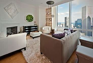
Interior Design Style color palettes with our favorite white paints.
- Apr 21, 2023
- 4 min read
Updated: Apr 27, 2023

Choosing the right paint color can make or break your design. It’s the color that pulls together the rest of your design elements, sets the tone for the entire room, and influences the overall mood and atmosphere.
Last week we went over how to choose the best white paint color for your space (Click here to read that blog!). This week we’re going over the best white paint colors, and an example of their subsequent palettes, for a few popular Interior design styles.
In today’s blog post we’re covering the best paint colors for Contemporary, Traditional, Mid-century Modern, Industrial, Bohemian, and Scandinavian design. These different design styles and eras are defined by their unique elements, such as color palettes, shapes, and furniture motifs. Each of these different interior design styles lends themselves to unique paint color selections to achieve their desired look and feel.
Contemporary Design

Contemporary design often features clean lines, neutral colors, and a minimalist approach. Contemporary color palettes can lean warm or cool and your white should reflect the rest of your chosen palette. For a warm contemporary palette colors featured are likely beiges and taupes, with hints of almost black dark browns. The palette below has been selected from Benjamin Moore's collection. While a cooler contemporary palette will likely feature grays. For a safe white that will work with any contemporary design I have chosen " Pure White" by Sherwin Williams. These neutral and contrasting palettes provide a calm and sophisticated backdrop. If you’d like to add accent colors, consider bold pops of color such as red, yellow, or green to add
interest and energy to the space.

Traditional Design

Traditional design often features warm, rich colors that create a cozy and inviting atmosphere. A warm rich yellowy white would suit this palette beautifully, like "Whitetail" by Sherwin Williams . Consider colors like cream, beige, or light brown to create a warm and welcoming backdrop. The palette below has been selected from Sherwin Williams collection. Inviting that sunny warmth into the neutral elements of your design. For contrasting accents, consider deep shades of red, green, or blue to add depth and richness to the space.

Mid-Century Modern

Mid-Century Modern design often features bright and bold colors, geometric patterns, and playful accents. A warm white is best for this style. "Atrium White" by Benjamin Moore is a great choice for Mid-Century Modern style. Consider bold colors like turquoise, orange, or mustard yellow to create a vibrant and energetic backdrop for this color palette. The palette below has been selected from Benjamin Moore's collection. For accents, choose colors like pink, green, or blue to add a playful and retro touch to the space.

Industrial

Industrial design often features raw and natural materials like exposed brick or concrete, and a muted color palette. A Neutral traditional white compliments this design style. "Vapor" by Dunn Edwards has a slight gray tinge which goes wonderfully with typical industrial metals. Create a palette using gray, black, or white to create a minimalist and industrial backdrop. The palette below has been selected from Behr Paint's collection. For accents, consider warm natural colors like rust, copper, or burnt orange to add a touch of warmth and contrast to the space.


Bohemian
Bohemian design often features eclectic patterns, textures, and jewel tone colors that create a free-spirited and relaxed atmosphere. Often mixing traditional and cultural design elements to create a curated unique space. A neutral white, like "China White" by Benjamin Moore, will mesh well with the varied patterns and colors already present in your design. Though color palettes for bohemian design can be wide and varied, consider natural colors like beige, terracotta, or olive green to create an organic backdrop that meshes well with historical elements. The palette below has been selected from Sherwin Williams collection. For accents, consider bold and colorful patterns like paisley, floral, or geometric prints to add that bohemian touch to the space.

Scandinavian

Scandinavian design often features a neutral color
palette, clean lines, and natural materials. I suggest a slightly warm off-white like "Sea Salt" by Portola Paints for this palette. Which complements the pastels traditionally present in Scandinavian design. For this color palette consider pastel colors like white, dusty rose, mauve, or beige to create a minimalist and airy backdrop. The palette below has been selected from Portola Paints collection. For accents, consider warm and natural textures like wood, wool, or linen to add a cozy and inviting touch to the space.

In conclusion, paint color selections are a crucial aspect of Interior Design, and different styles require different colors to achieve their desired look and feel. Whether going for a dreamy bohemian look or a cozy traditional home, considering the overall style of the space and choosing colors that complement it will help you create a cohesive and beautiful design.
As an Interior Designer, I have seen a multitude of spaces featuring all different styles and color palettes. If you have a space you are looking to refresh, I am here as a resource to help you achieve the design of your dreams. Whether you are looking for a quick consult or someone to oversee the entire design process I am happy to help. Set up a consultation with me and let’s start the wheels rolling toward a space that reflects your personality and style. Let’s design your dream home!


Comments